If you are already running an eCommerce website, you are doing well, but there is still more to it. Internet access has shifted from desktops to mobile devices. If Google is already implementing techniques to match this trend, you should be more concerned about the effectiveness of your website. Irrespective of your niche and target audience, mobile devices are taking over and ignoring this trend can cause your business to flop in a few weeks.
Whether you are offering products or services, access to your site is mostly through tablets and smartphones. People barely have time to sit back at desktops to search the web. Even if your products are targeting corporations, they will likely be searching on their phones while in the office. Your website should load properly on mobile devices; all the graphical features should adjust based on pixel capability of mobile devices.
The trend has triggered a debate on the effectiveness of mobile responsive sites in comparison to mobile friendly sites. There is no clear distinction; they are both effective considering that they involve mobile devices. Suitability of each is dependent on your website objectives and the specific audience you are targeting.
Therefore, before you implement either of the two, you familiarise with the features, functionalities, and determines whether they match your website goals.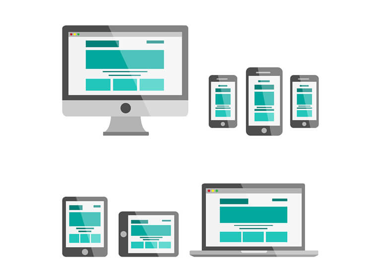
Mobile responsive design
A responsive website design adjusts its pixels and other graphical features depending on the size of the device. The aim is to enhance the important features on the web page even if it means cutting out unnecessary content and photos that might interfere with the visibility of the core features.
Typically, the images and texts adjust from a three-column layout to a single column depending on the size of the mobile device. A mobile responsive website can be noticed on a desktop; you will notice the difference in image and text size when you reduce the window size. The appearance often changes; in most cases, some details are cut out or simply fitted in another location on the web page. While every content might be reducing in size, the distinctive features will remain highlighted.
Website responsiveness is crucial in keeping site visitors engaged while on their devices. It is often disturbing and frustrating to access a website that takes too long to load. Site visitors are impatient, and you are likely to lose quality traffic because of an unresponsive website. Most likely, your site visitors get referrals or an idea of your site through social media while on the phone, this means they will open the link while on the mobile device. The credibility of your site will be quickly dismissed if it doesn’t load in a few seconds.
The first few seconds of web page loading determines your fate. Site visitors barely give you a second chance to retry loading the website. Today, most people are alert on virus infections from URLs; shaky loading time will raise suspicion and keep potential customers off the site. A mobile responsive site will attract users anytime.
Features
• Optimised images
• Flexible spacing and padding
• Flexible content that changes depending on the device
• Reduced navigation
• Effectiveness depends on mobile operating systems
Mobile-friendly design
This website design focuses on simplicity and ease. Apart from navigation drop down, which is obviously difficult to use on a mobile, all other website features are available on mobile devices. The design aims at offering all the quality features and experience of users on a computer in the same way as access on a mobile device.
You can barely notice any difference when viewing it on a PC and on a smartphone. User experience is a priority in this. This reduces the rate of confusion with respect to navigation while on the site. Maintaining the structure and features on mobile devices and desktops makes it easy for regular users irrespective of the device. Responsive websites can be challenging because a user has to adjust to the new layout whenever they change a device; this is the main distinction between a responsive and friendly website design.
Familiarity has everything to do with user friendliness. The fact that site visitors with the location of different tabs and can easily navigate makes it unique. Typically, mobile devices have small screens meaning a bit of strain in finding details on a web page. It is easier for site visitors if they are dealing with a static layout rather than having to check every other time for features they use on a regular basis.
Also, mobile devices are for quick access of the internet; familiarity with a site enhances this feature because the layout doesn’t change.
Features
• Simple navigation buttons
• Static content and layout
• Small image and text display
• Consistency; its effectiveness and efficiency is not dependent on a mobile operating system.

Which is the best?
Both designs are effective, but it depends on your business structure.
To determine a suitable design for your website, consider the number of users using a mobile device and complexity level of your images and web page design. Font styles can also influence your decision if a style is crucial for your business.